Showing posts with label Trailer. Show all posts
Showing posts with label Trailer. Show all posts
Tuesday, 11 March 2014

Friday, 28 February 2014
Teaser trailer: Third draft
NFY final edit final from Media @ St. Bons on Vimeo.
After trying to edit our original trailer, we had found that many of the elements had been deleted therefore we decided to produce a new trailer including some of the old elements, but also going out and recording more footage in order to anchor our horror genre. This is our first edit of our new horror teaser trailer.
Thursday, 6 February 2014
Trailer development
During our teaser trailer development, we had to alter the sound effects in order for it to link to the conventions of horror soundtracks. Therefore, we had to mute each scene to allow us to add on other sound effects such as 'eerie wind music'. Also, as teaser trailers consist of a time length of 40 secs to 60 seconds, we then had to time stretch various scenes to fit the timing.


Wednesday, 1 January 2014
Friday, 20 December 2013
Development of final shot
For one of the final shots in the trailer, we had planned to create a shot where the dolls eyes (and nothing else) would move, like one of the shots in the 'dead silence' trailer. To do this is I started off my taking pictures of the doll, experimenting with different angles, and in the end chose one I thought would work best.


This is the final product:

I then opened the image on photoshop, and used the 'polygon lasso tool' to select the iris of the dolls eye, and cut and pasted it as a new layer. I then selected the rest of the eye, and once again cut and pasted it as a new layer. I then filled in the blank parts of the 'whites of the eye' using the 'brush tool' and the 'smudge tool'. I then darkened the corners of the eyes once again using a black 'brush tool' and then using the 'smudge tool' and 'blur tool'.

After that, I manipulated the colour of the iris by adjusting the 'hue/saturation' the 'levels' and 'curves' until i got the sharp blue colour. I wanted the eyes to stand out and look almost lifelike and real to juxtapose against our already perceived idea of the 'lifelessness' of an inanimate object like a doll. I also darkened the edges of the iris to make it look more sinister, by creating a new layer and using the 'brush tool' and then blend it by making the layer blurry (filter>blur>Gaussian blur).

I then wanted to manipulate the colour of the skin to look pale and sickly. I did this firstly by selecting the skin of the doll and then cut and paste it as a new layer. I then adjusted the hue/saturation until the desired look. I then created a new layer, and using the 'brush tool' in black with an opacity of 50% I went over areas where I wanted to darken. I then blended it by using the 'Gaussian blur' filter. I repeated this step once again in areas I felt needed to be made even darker. I then changed the colour of the dolls lips by selecting, cut and pasting them as a new layer. I then manipulated the colour using the 'curves'.

After this I saved the three different psd files, one with all the layer for the iris, another for the whites of the eyes, and another for the skin and the rest of the doll.
I then opened these psd's on after effects, positioning them so that first was the main image of the doll and skin, next was the iris and beneath that was the whites of the eyes. I then clicked the stop watch icon for 'position' under the layer for the iris.I then entered a key frame at the start where the iris is placed in its original position, and then a key frame near the end, where the iris is placed to the left.

This is the final product:
Wednesday, 18 December 2013
Teaser trailer first draft: feedback
A focus group of seven students aged 15-20 years old, from an ABC1 socioeconomic bracket had watched the first draft of our teaser trailer and then completed this survey.The findings are summerised in the prezi bellow.
or click here.
or click here.
Tuesday, 17 December 2013
Teaser trailer: First Draft
This is our first draft of our teaser trailer in which we started to embed our footage.
NFY edit from Media @ St. Bons on Vimeo.
NFY edit from Media @ St. Bons on Vimeo.
Monday, 16 December 2013
Edited images!
For our teaser trailer we decided to add some fast paced shots of original images of the cursed doll Annabelle as it is based on a true story and we thought this would invite more of a wider audience. We decided to edit the images so they are not exactly the same of the original ones and we did this using Photoshop by editing the colour, brightness and contrast. We tried to make them look as historical as we could.


Friday, 13 December 2013
Soundtrack influences
For our first edit of our teaser trailer, we chose to use a sound track from an influential film to us which is called 'Dead Silence'. At first, this version seemed to fit into our narrative and was going to be used throughout, however as everything started to come together, it did not bind with the images or clips shown at the time and did not submerge with our edit the way we intended it to do so.
After noticing the soundtrack did not fit, we searched for the same soundtrack but in a different version which started off quietly and tied our teaser trailer together.
We went back onto our research and was drawn into how 'The Conjuring' had a contrast of an 'uplifting' music' in binary opposition to the loud horror music towards the end. This enabled us to understand the generic convention of a horror trailer and decided to follow the same pattern by using the same soundtrack which is called 'Hurdy Gurdy Man' by Donovan. Along this, we recorded mouse clicks to sound like camera shutter lens to portray the historical images which can also be seen in 'The Conjuring' from 00:26 seconds and we thought was to be effective.
After noticing the soundtrack did not fit, we searched for the same soundtrack but in a different version which started off quietly and tied our teaser trailer together.
We went back onto our research and was drawn into how 'The Conjuring' had a contrast of an 'uplifting' music' in binary opposition to the loud horror music towards the end. This enabled us to understand the generic convention of a horror trailer and decided to follow the same pattern by using the same soundtrack which is called 'Hurdy Gurdy Man' by Donovan. Along this, we recorded mouse clicks to sound like camera shutter lens to portray the historical images which can also be seen in 'The Conjuring' from 00:26 seconds and we thought was to be effective.
Sunday, 1 December 2013
Saturday, 30 November 2013
Title development: production
I had decided to do something simpler for the titles in the middle of the the trailer as this is a convention many other trailers seem to follow, take for example, the Conjuring;
 at first where the narrative was being set up, and all the horrific/scary events had taken place in the past, the titles were very simple, with just a plain serif font on a black background, and the font was positioned near the top left.This simplicity may have been used to help establish the historical context and add to the idea of it being 'based on a true story'.Once the narrative is established and the the horrific events start in the 'present' the titles also change, and become more animated, with the grunge texture starting to peel and crack through the background, the text now has sans serif font that's in the center of the frame.
 The title of the name of the film 'the conjuring' also has a light effect across the text to make it stand out from the rest of the titles and fonts. This is what I decided to replicate in my trailer, by using no light effects in the titles for the middle of my trailer, but using the light and shadow effects with the last titles for 'Annabelle' and 'coming soon'. For the titles in the middle of my trailer, I decided to maintain a house style by using the same font and the same texture in the background, however, instead of having the light and shadow, I decided to have the text subtly scale the text so that it grown slightly in size.
from the makers of 2 from Media @ St. Bons on Vimeo.
this winter she will not sleep from Media @ St. Bons on Vimeo.


from the makers of 2 from Media @ St. Bons on Vimeo.
this winter she will not sleep from Media @ St. Bons on Vimeo.
Friday, 29 November 2013
Main title development: production
After choosing a font from our story board of typogaphy ('I still know') we then chose a grungy texture by simply doing a quick search for them on Google images. I found a texture from hdwallpapers4free.com which stated that the texture could be used for free for personal or commercial use. I then opened the texture on Photoshop and manipulated the colour (image>adjustments>curves) and levels (image>adjustments>levels) and then added text using the horizontal text tool, and then added effects to the text (add layer style>drop shadow) so that it looked how we wanted it to before animating it on after effects.
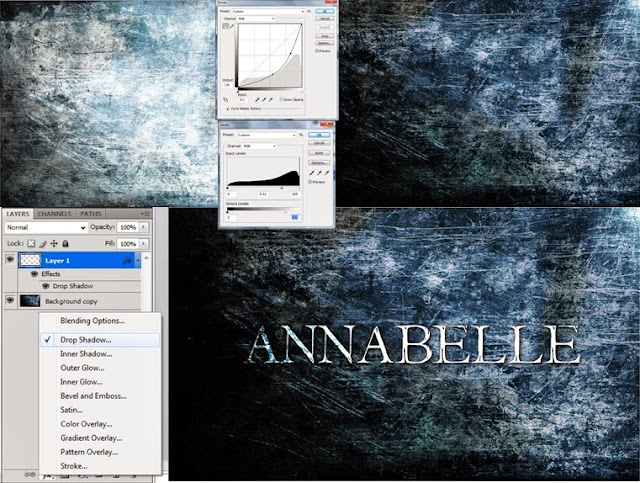
I then opened it up on after effects and made it a 3D layer. I then created a created a new solid black layer and cut out an ellipse using the ellipses tool, and then I set it to subtract, and adjusted the feather to a place where I liked it.I then added the effect CC glass to the layer, which made the image look bumpy and blurry so i adjusted the surface, softness and height until it was back to how it was supposed to look.

I then added a new light (layer>new>light) and then adjusted the settings so that the light type was 'point light' and then adjusted the softness and height so it had the desired effect. I had also adjusted the settings under the 'shading'. I then started to animate it by pressing the 'stopwatch' icon next to the light position.I then linked the annabelle light position using the 'expression pick whip' to the layer 'light 1'. This then brought an 'error' pop-up,which I resolved by typing in 'thisComp.layer("light 1").toComp([0,0,0]);'. I then made the light move across the image by pressing the stopwatch next to 'position' under the 'light 1' layer. Then with my key frame at 00s with the light position far to the left, and then dragged the key frame to the end of the timeline and dragged the light position to the far right.

I had then also managed to to get the shadow to fade in and out with the light position by pressing the stop watch next to all the options under the 'shading' tab under CC effect, and bringing the options down to 0 at the start and the end of the composition. This is the final product:

I then opened it up on after effects and made it a 3D layer. I then created a created a new solid black layer and cut out an ellipse using the ellipses tool, and then I set it to subtract, and adjusted the feather to a place where I liked it.I then added the effect CC glass to the layer, which made the image look bumpy and blurry so i adjusted the surface, softness and height until it was back to how it was supposed to look.

I then added a new light (layer>new>light) and then adjusted the settings so that the light type was 'point light' and then adjusted the softness and height so it had the desired effect. I had also adjusted the settings under the 'shading'. I then started to animate it by pressing the 'stopwatch' icon next to the light position.I then linked the annabelle light position using the 'expression pick whip' to the layer 'light 1'. This then brought an 'error' pop-up,which I resolved by typing in 'thisComp.layer("light 1").toComp([0,0,0]);'. I then made the light move across the image by pressing the stopwatch next to 'position' under the 'light 1' layer. Then with my key frame at 00s with the light position far to the left, and then dragged the key frame to the end of the timeline and dragged the light position to the far right.

I had then also managed to to get the shadow to fade in and out with the light position by pressing the stop watch next to all the options under the 'shading' tab under CC effect, and bringing the options down to 0 at the start and the end of the composition. This is the final product:
Wednesday, 27 November 2013
Title development: planning

 Often in trailers the last shot is the name of the film that is often used at after one of the most effective and shocking shots in the trailer, in order to make the shot of the title very memorable and very effective and shocking. One thing I had noticed is that often the font and background used is in keeping with the genre and narrative of the trailer and film. For example, for 'the woman in black' the background is of a window frame, with what looks like a very cold windy day behind. This location is an important part of the narrative of the film as many of the narrative turning points take place here, which is also captured in the trailer. For example, the window sill is where three little girls inexplicably committed suicide in the open sequence, and is also a feature of the trailer where the protagonist is looking out of the window and see's a demon/ghost. Including the window frame as the background in this shot is therefore very effective at tying the whole trailer together. The font is also quite symbolic as it looks quite faded and almost 'ghost' like which is in keeping with the supernatural and historical horror genre. I had also noticed there's a slick like fabric that flows on top of the text, which I think represents the material of the dress of the actual 'woman in black' which is also quite effective at tying together all the narrative themes and the genres conventions.
Other titles for films also use a font to help convey the genre of the film, for example 'the conjuring' 'the women in black' and 'sinister' uses a serif sans font which adds to the idea of a historical setting of narrative and draws very subtle references to old religious beliefs about possession and exorcisms. From this is realised the importance of font, so I found some fonts on dafont.com and collected my favourite ones in the name of our film 'Annabel' in order to compare and contrast them.

From this mini storyboard of font ideas, me and my group decided to go with the font 'I Still know' (http://www.dafont.com/i-still-know.font). This is a sans serif font with a distorted kind of texture which is very similar to the font used for the 'women in black' 'sinister' and 'the conjuring' all of which are films with very similar to narratives to our films, so hopefully we will be able to recreate the same sort of atmosphere and mise en scene as the trailers for these films.
Monday, 25 November 2013
Production company logo development

One thing I had also noticed about the production logos in these trailers is that they are often very simple, and understated but also quite recognizable and memorable. This is something I have therefore incorporated when creating the logo for my production company.


nfy LOGO from User22113231 on Vimeo.
Sound Tracks!
Soundtrack

After creating our storyboard, we started to
consider music for our teaser trailer. The theme song of the film ‘Dead Silence’
by Charlie Clouser was one of our favourite choices. We preferred the piano
version because we thought it would match well with particular scenes in our
teaser trailer, for example the carousal scene. It was much slower and would
build more tension towards the audience. It also matches with our sub-genre of
horror that is supernatural and psychological. We decided that we are only
going to use the first 28 seconds of the song as we don’t need that much of it
and it will only be playing during certain scenes of the teaser trailer.

For the other parts of our teaser trailer, when
messages appear we decided to add eerie wind sounds as this will anchor the
audience into the teaser trailer as it is very common for trailers to add
these. It would also make the audience feel anxious as there is no music playing
and there is just wind and messages appearing on the screen. It will make them
anticipated for what is coming. We decided to use the first 26 seconds of this
clip that we discovered on YouTube as we thought it would fit in well with our
teaser trailer.
Tuesday, 12 November 2013
Storyboard Frame Sheet
Here is our updated storyboard in which we added more detail in the types of shots and sound we are going to be using. We also changed the story line to fit into the sub-genre of horror which is demonic/spiritual.
Timings
|
Sketch Frames
|
Visual
|
Audio
|
Shot
No: 1
|
 |
BBFC film certificate will appear as
we are doing a UK release film.
|
No audio.
|
Shot
No: 2
|
 |
Our production name and logo will
appear on the screen in order to promote our company to other audiences to
increase marketing popularity.
The camera will zoom into this.
|
No audio.
|
Shot
No: 3
|
‘From the producers of Paranormal
Activity and Insidious’
|
This will appear for two seconds for
the purpose of showing the audience that the company is associated with other
well-known films and this anchors into the genre of horror and creates cultural capital for the audience towards this genre. This is also known as director marketing. The typography
will be bold and big and the camera will zoom into it.
|
Diegetic sound of an eerie type of
music.
|
Shot
No: 4
|
 |
-Wide shot of the two main characters Mise-en-scene of props will show that they are just moving in to a new house.
|
Dialogue of the two girls talking and
noises in the background.
|
Shot
No: 5
|
 |
-Close up shot of the doll. Camera will zoom in to reveal the face of the doll.
-Questions are asked about what the
doll is
|
Dialogue of the girls talking. Quiet
music when the camera zooms into the doll into a close up shot.
|
Shot
No: 6
|
‘Based on a true story’
|
A message will appear. The typography
will be bold and big. The camera will zoom into the message before changing
to the next scene.
|
Diegetic quiet music.
|
Shot
No: 7
|
 |
Jump cuts of loads of shots of the
history of the doll. Flash cut editing in order to make the pace faster and
create tension to the audience. Mise-en-scene will reveal a de-saturated colour palette here.
|
Diegetic quiet music. Every shot that
appears on the screen, there will be a ‘click’ of a camera sound.
|
Shot
No: 8
|
 |
Wide shot of the girls having a
conversation. They decide to keep the doll.
|
Dialogue of the girls talking.
|
Shot
No: 9
|
'This winter she will not be asleep'
|
A message will appear on the screen to
the audience letting them know a hint of the story line.
|
Diegetic sound of music will be added
in here.
|
Shot
No: 10
|
 |
More jump cuts of scenes from the
actual film giving the audience a hint of what they are going to see.
|
Diegetic sound of fast paced music
will be added in here.
|
Shot
No: 11
|
 |
The screen will be blank here for approximately
two-three seconds. This anchors in with the genre as a lot of horror teaser trailers contain these blank screens to build suspense.
|
It will be silent in order to build
the tension.
|
Shot
No: 12
|
 |
A random scene of the camera zooming
into a carousal (showing the doll in the corner). The camera will be zooming
in at a slow pace.
|
There will be slow diegetic sound
added in which will be child play type music.
|
Shot
No: 12
|
 |
There will be a jump cut, the screen
will go blank and then the doll will appear closer to the carousal.
|
Slow diegetic music added here and
will then stop.
|
Shot
No: 13
|
'Coming Soon'
|
‘Coming Soon’ will appear on the
screen. The typography will be bold and similar to those of other horror teaser trailers.
|
|
Shot
No: 14
|
 |
The title of the film ‘Annabel’ will appear on
the screen.
|
Friday, 8 November 2013
Call Sheet
The main reason we have decided to produce a call sheet is to maintain our time efficiently and to be organised with our work.
NFY MEDIA
Call Sheet
Production
team and crew
Producer:
Yohanna
Director:
Nadia
Cameraman:
Fatimah, Yohanna, Nadia
Soundman:
Fatimah
Actors
Character
|
Actor
|
Filming
Days
|
Emily
|
Shaista
|
Friday
|
Mariya
|
Fatimah
|
Friday
|
Scene
no.
|
Props
|
4
|
Doll
|
4
|
Boxes
|
4
|
Photo
frames
|
11
|
Carousel
toy
|
Scene
no.
|
Location
|
4
|
House
|
4
|
Empty
room
|
Monday 21st
Pre-Production
|
Tuesday 22nd
Pre-Production
|
Wed 23rd
Pre-Production
|
Thursday 24th
Pre-Production
|
Friday 25th
Pre-Production
|
Saturday 26th
|
Sunday 27th
|
Monday 28th
Pre-Production
|
Tuesday 29th
Pre-Production
|
Wed 30th
Pre-Production
|
Thursday 31st
Pre-Production
|
Friday 1st
Pre-Production
|
Saturday 2nd
|
Sunday 3rd
|
Monday 4th
Photo shoot
|
Tuesday 5th
Titles development
|
Wed 6th
Locations
|
Thursday 7th
Storyboard
draft
|
Friday 8th
Finalise
storyboard
|
Saturday 9th
|
Sunday 10th
|
Monday 11th
Sketches of magazine
|
Tuesday 12th
Font styles
|
Wed 13th
Evidence of development/
drafts
|
Thursday 14th
Comparison between independent/
mainstream
|
Friday 15th
Start
filming
|
Saturday 16th
|
Sunday 17th
|
Monday 18th
Filming and
Editing
|
Tuesday 19th
Filming and
editing
|
Wed 20th
Filming and
editing
|
Thursday 21st
Finishing
poster
|
Friday 22nd
Poster
completed
|
Saturday 23rd
|
Sunday 24th
|
Monday 25th
Additional
Shots
|
Tuesday 26th
Soundtrack
research
|
Wed 27th
Inspiration of
soundtrack
|
Thursday 28th
Final
soundtrack
to use
|
Friday 29th
Reflection
of storyboard
|
Saturday 30th
|
Sunday 1st
|
Props
Locations
Shooting
Schedule: Friday 15th
08:00 – Meet
up at school (St Bonaventure’s Sixth Form)
09:00-12:00 –
Shoot our two female protagonists who will be in an empty room showing they
have newly moved in. Then shoot the other scene of them discussing the random
doll in the room. PROPS: Boxes, papers, clutter everywhere, photoframes, the doll. ACTORS:
Olivia and Vanya
12:30- 1:30 –
LUNCH
2:00-5:00 –
Shoot multiple scenes of the doll and any significant features that fit into
our genre of film.
SHOTS:
Close up, wide shot, camera panning, mid shot, two shot
Subscribe to:
Posts (Atom)