
Showing posts with label Poster. Show all posts
Showing posts with label Poster. Show all posts
Wednesday, 5 March 2014

Sunday, 2 March 2014
Film Poster - Draft one

overall we were quite happy with the way the poster turned out in the first draft. We also collected audience feedback on it to assess whether it could clearly be identified with our film's brand, and also to assess if the supernatural horror genre was clear, and we also use this feedback for any cosmetic changes. We also made changes such as making her skin look more pale to emphasize expressions such as being scared which was also a generic convention of horror, along with removing a red dot on her nose which was caused by the camera quality that we used.
Friday, 28 February 2014
Film Poster Production

The first step in producing the poster was to make a basic, generic template with the name of the film, the credits and the sell lines using the text tool in photoshop. After that, I inserted the image of the central protagonist, after I had removed the background from the original image using the free select tool. After that, I adjusted the 'curves' and 'levels' in order to make the picture look darker so it fits the horror genre better. I also decided to move the credits to the the top, and move around some of the other sell lines to make it look more stylistic. I also decided to add a backdrop to the main title 'Annabelle' to make it stand out more then the other sell lines. I also decided to add a circular gradient of dark navy blue to black in the background to make it look more interesting then just a solid black background. To make it look more stylistic, and more attuned to the horror genre, I decided to make a 'dark, stormy sky' in the background. I did this by finding a picture of a very cloudy sky on google images, and then scaled this image to fit in the background, and then set the layer to 'multiply' ontop of the gradient. This created a nice, subtle background texture. After that, I cut out the house using the free select tool, and removed the background. I then pasted the house into the poster, and placed the image ontop of the 'background' layers (solid black background, the gradient, and the clouds) and behind the text layers and the layer with the image of the protagonist. After that I adjusted the colours and curves so that the house looked a bit older and went with the desaturated colour palette to match the horror genre. After that, I cut out the bckground from an image of the doll, and scaled it so that it it would look a realistic size in the window of the house,to do this i had to crop it, and I also adjusted the curves and colour's to make it look more natural. I had also added the logo for 'nfy productions' aswell as adding a 'rated' warning. I also added the national lottery logo to anchor the idea of it being an independent film, and I also added a hashtag '#shewillnotsleep' to make media convergence links to social networking sites, which is becoming more common in many film campaigns.
Tuesday, 3 December 2013
Poster Ideas
Here are some drafts that we drew out for ideas for our official film poster. We were influenced by other horror film posters and tried to use the codes and conventions of them in order to make our poster look more towards the genre.


Here is one poster draft. The poster was influenced by the film 'The house at the end of the street'. On the left side of the poster there is the main female character looking in shock and in the far background there is a house. In one of the windows of the house we see the doll. We thought that this would create fear towards the audience and that it would be a good idea as it does not reveal the story but keeps the audience wondering why the doll is there. The title is written at the top, big and bold in order to stand put and the tag line 'She will not be asleep' is at the bottom.

Here is another possible draft that could help us with our final film poster. This poster consists of a close up shot of the doll revealing details of the doll in order to scare the audience. We found that a lot of horror film posters were very simple and just consisted of one image so therefore we decided to keep one poster simple in order to follow the conventions. The poster is dark and the tittle is written in big at the bottom of the image to stand out and catch the eye of the audience.
Saturday, 30 November 2013
Poster Influences!
For our film poster for our horror teaser trailer, We decided to get familiar with other horror film posters in order to give a slight idea as to how we could create our poster. This helped with the layout of film posters and also helped to decide the shot we will use for our main image on the poster.The following images obtained from research shows us a clear convention used to make the posters effective. They tend to follow a trend of a dark background. As shown below, they have obscured the eyes in some way as the eyes are generally what create a personal connection with the audience. Furthermore, the most emotion comes from how the eyes look. This has influenced us to follow in the same pattern and create a poster with a doll’s face to be the main image to achieve the effect of binary opposition where the doll is stereo typically supposed to be an innocent toy for girls but instead it is the main reason for the supernatural events.

This is the film poster for the film 'Dead Silence'. As you can see the poster only consists of three main colours, red white and black and this is conventional to horror film posters as most of them only consist of three main colours. The colours all contrast well together and match well with the genre showing the audience that it is a horror film. The typography of the title is written in white and the font is unique and blurred in order to give the audience a blurred vision and to make it more effective towards horror. There is a only one image used in this poster which is of a doll and since our horror teaser trailer is based on a doll we decided to get ideas from this poster. The image is a close-up shot and the action that the doll is doing matches with the title of the film. Although the poster is very simple, it still allows the audience to know the genre of the film through the different elements such as the tag line which says 'You scream, You die' which would attract an audience looking to watch a horror film.

The 'Bride of Chucky' film poster also consists of three main colours which are black, red and white. The background of the poster is all faded black which is similar to most horror posters which has given me an idea as to how our background for the film poster could be. There is a close of shot of half the faces of two dolls. The eye on one of the dolls is blue and on the other is green suggesting evil. One of the dolls consists of scars on his face which shows pain and violence has been involved. This suggests that something bad will be happening in the film and could attract the audiences attention as they would begin to wonder how them scars had got there. As violence along with a lot of darkness is shown, this represents the genre making it clear that it is a horror film. The tag line which says 'Chucky Gets Lucky' is very short and simple. It does not give too much information out to the audience but it rhymes and this may give excitement to the audience and be effective towards the genre.

'The conjuring' film poster is quite different to the other two posters we looked at. It still carries the dark conventions however it is not as dark and the background is not black like the others. There is a dull colour palette used here and the colours are mainly black, grey and white (still three colours used throughout). we decided to look at this poster, as the film also consists a doll which is where we got out idea for our horror teaser trailer for. It was one of our main influences and so the poster will also help with ours. In this poster they use a long-shot and the image is not very clear to the audience, however we can see a child sitting on a chair with a doll on her lap. The child is facing the other way which creates mystery for the audience as to who it could be, however the audience are able to see a little bit of the dolls face. The typography of the title is written in a white bold font in binary opposition to the background and so it stands out and is clear to the audience.
Saturday, 26 October 2013
Bullet Boy - Film Poster Analysis
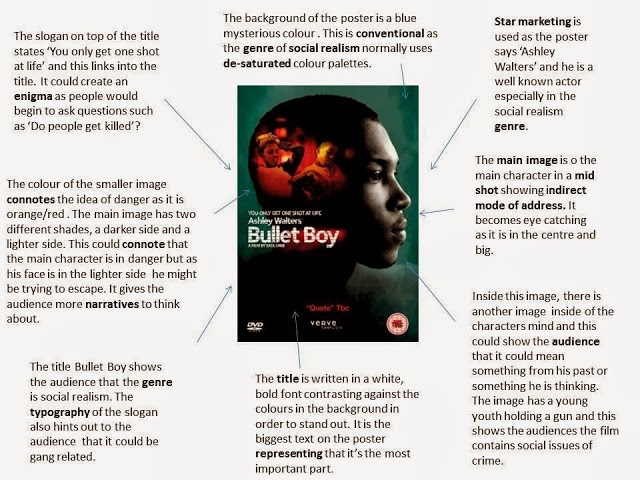
Here is my annotation of the film 'Bullet Boy'. The genre of this film is Social Realism which is different to the genre of our teaser trailer (horror). I decided to annotate a film from a different genre so I could see the contrast of the layout of the film poster.

Subscribe to:
Posts (Atom)